Core Element
Core Element is a trusted social media marketing agency that offers a range of services to help small businesses grow and build communities. They specialize in creating and implementing effective social media strategies that drive engagement and increase brand awareness.
Client:
Core Element Digital
Role:
Lead Designer
Year:
2022
The Challenge
In the ever-evolving landscape of social media marketing, Core Element, a trusted agency, faced the challenge of redefining its brand identity to cater to a different audience. We decided to rework the old logo (left) to usher in a new reinvigorated look.
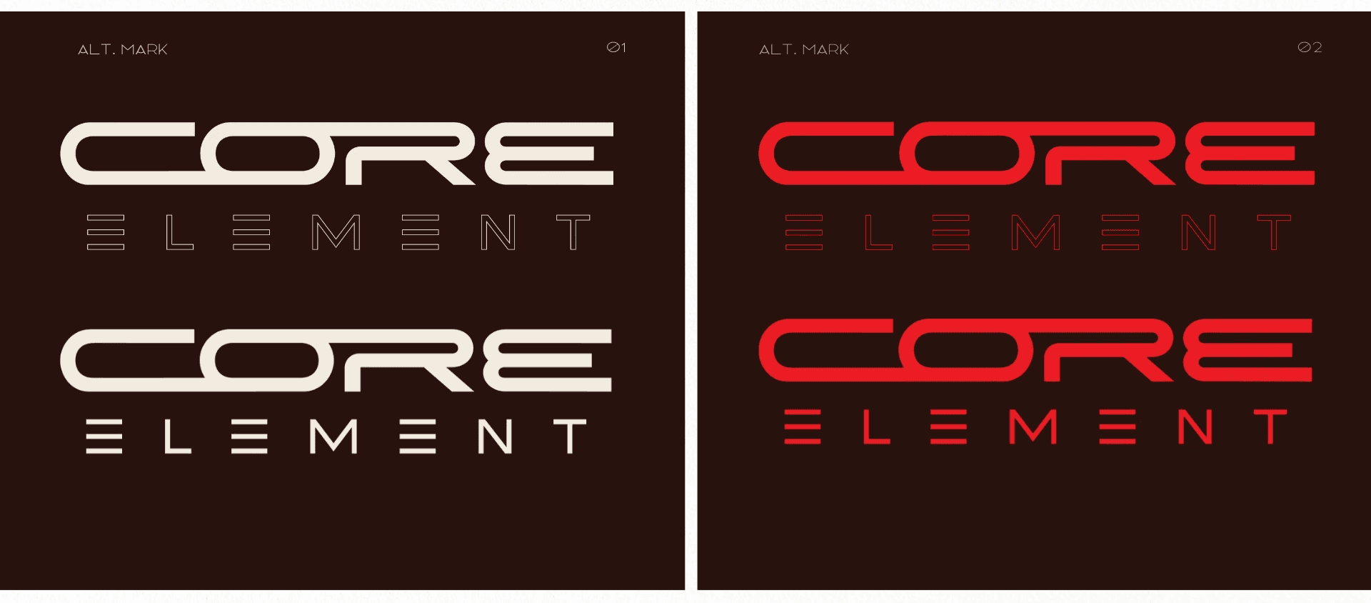
Create a distinct look to the new logo by putting emphasis on clean connected lines
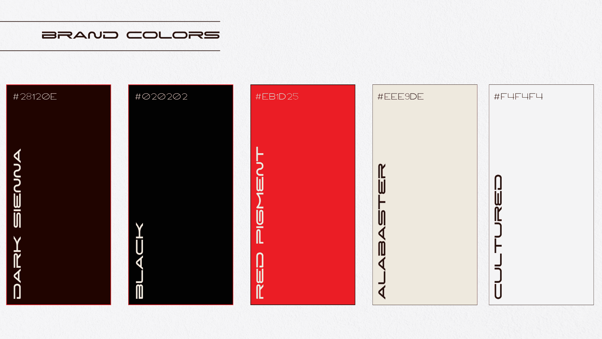
Keep the given color scheme with minor changes so the brand identity remains within the color range
Process
After conducting extensive market research and audience analysis, I delved deep into the psyche of the intended consumers, selecting visual stimuli from the examples above to build a captivating design. It was crucial to strike a balance between retaining Core Element's credibility, which was built over years, and infusing a fresh, appealing aura to attract the new audience.
The redesign process involved exploring various design elements, such as color psychology, typography, and symbolism. Each element was carefully chosen to evoke specific emotions and convey Core Element's commitment to trust, growth, and community building. Iterative design mock-ups were created and refined based on feedback from both the owner and potential representatives of the target audience.
Solution
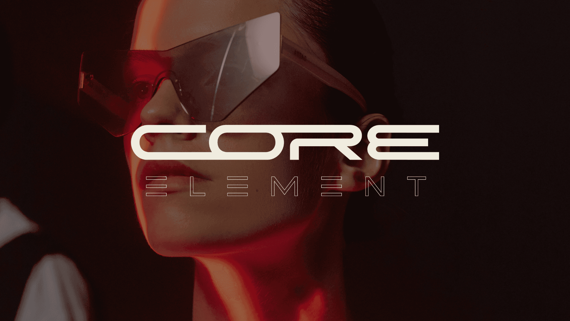
The final logo seamlessly blended Core Element’s established reputation with a modern, vibrant aesthetic that would resonate deeply with the new audience. It symbolized not just a visual change but a strategic adaptation to the evolving market dynamics. Through this project, Core Element not only acquired a visually appealing logo but also a powerful tool to connect with its new clientele, paving the way for sustainable growth and community engagement.
In essence, this logo redesign project served as a testament to the art of aligning a brand’s core values with the evolving expectations of a diverse audience, showcasing how thoughtful design could bridge the gap between the past and the future, while ensuring the brand’s essence remained intact.


